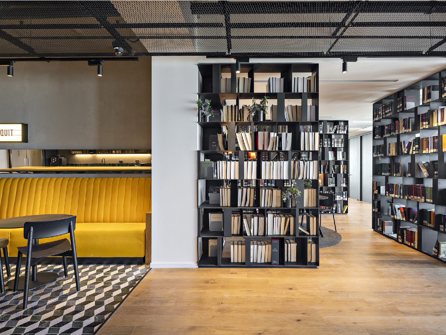
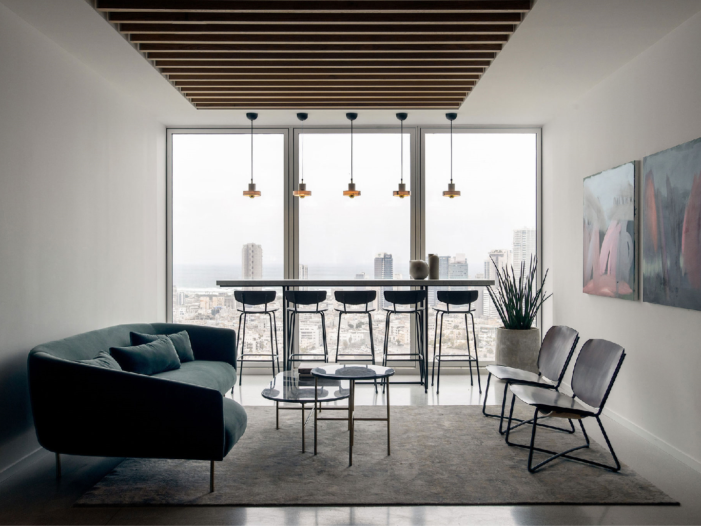
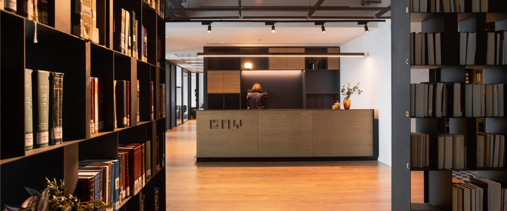
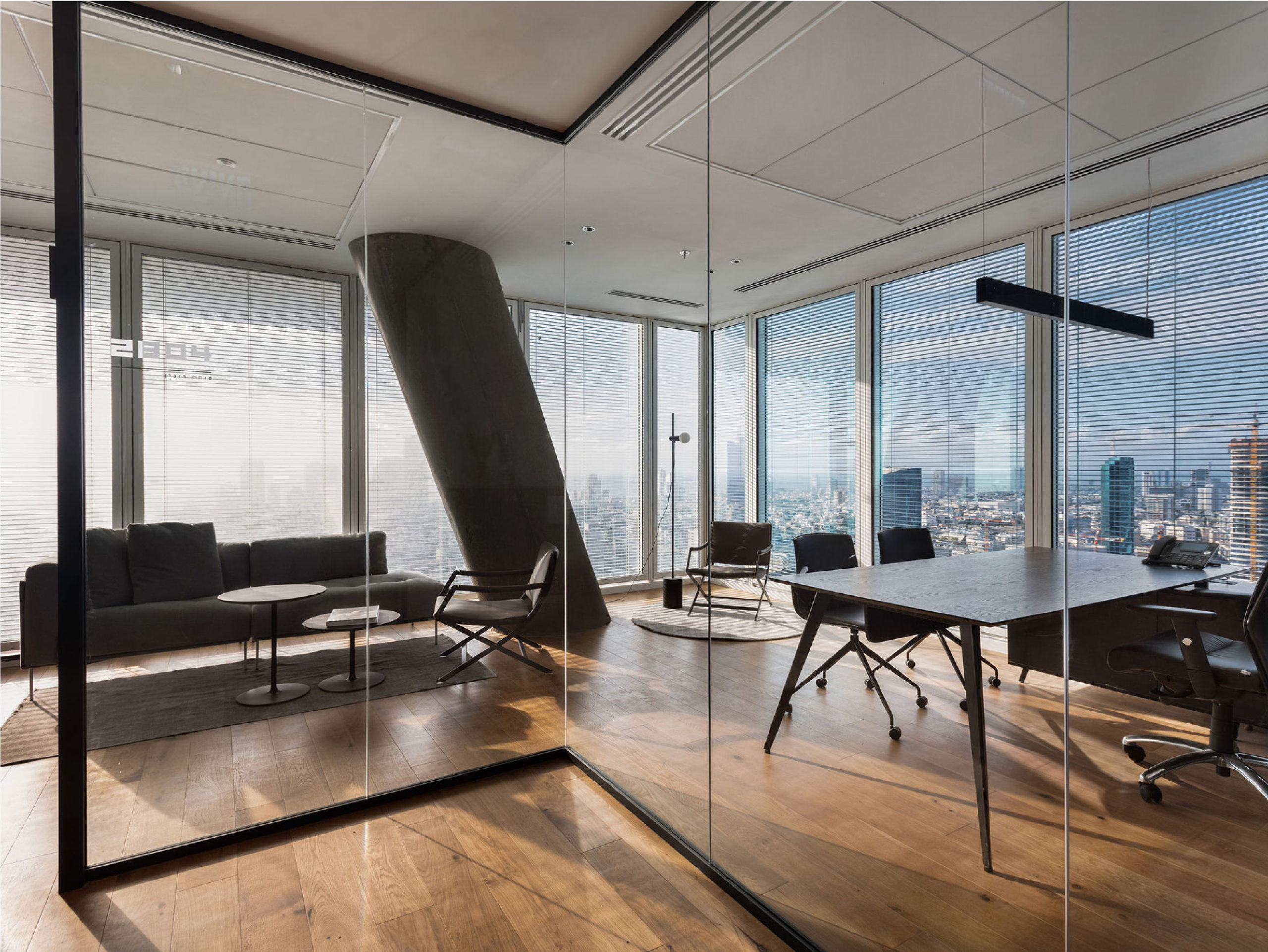
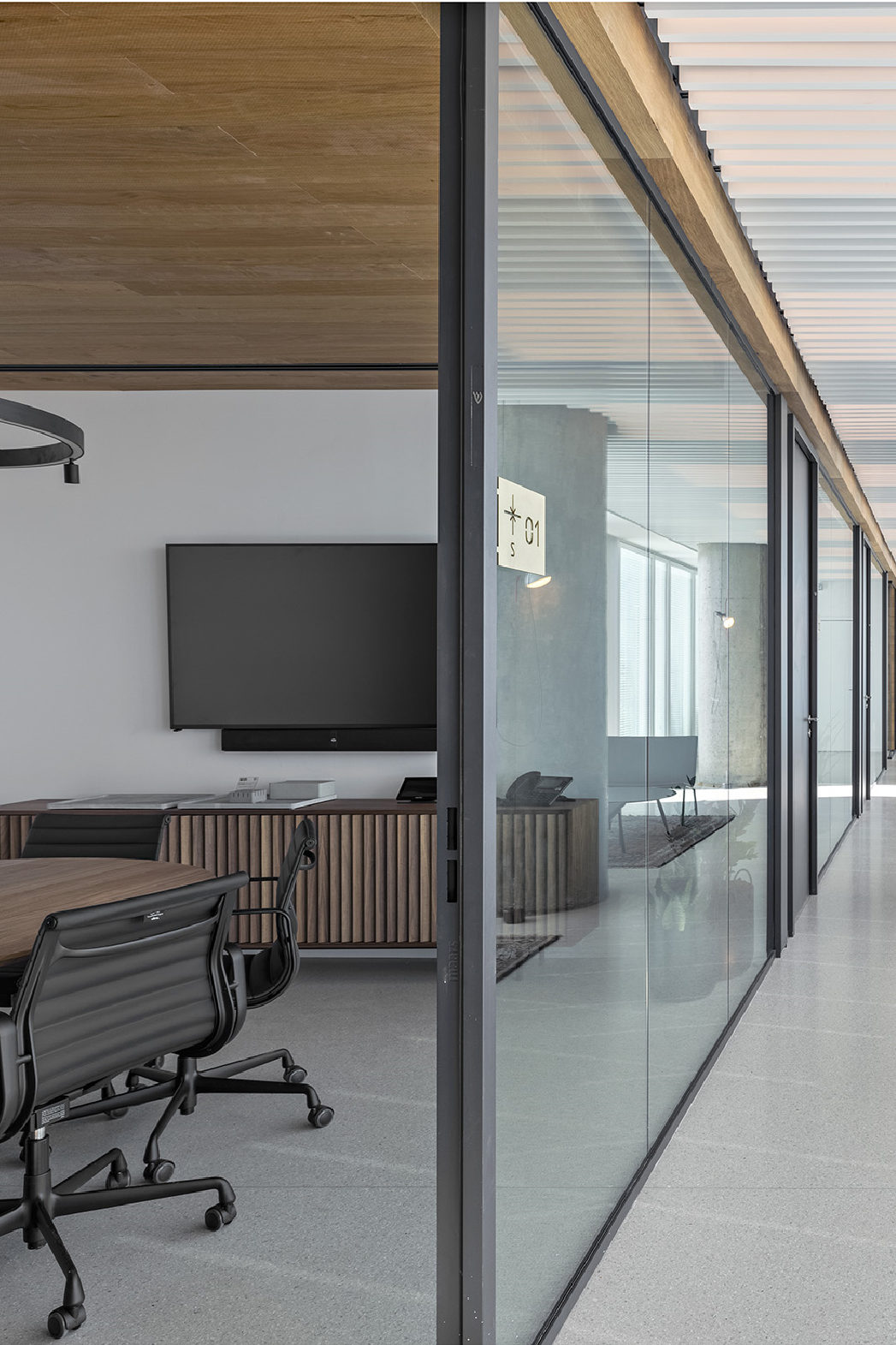
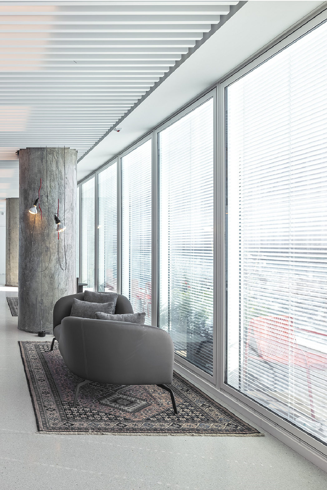
Bridging between tradition and innovation, the design concept for Gornitzky & Co. fuses minimalism with pop. Soft and smooth finishes such as linear furnishings, polished concrete and recessed lighting give way to pop elements such as decorative accent lighting fixtures, colourful furnishings and general uses of colourful surfaces throughout the space.
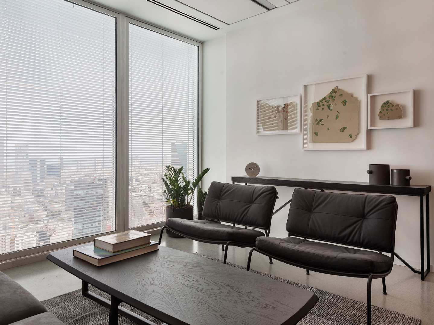
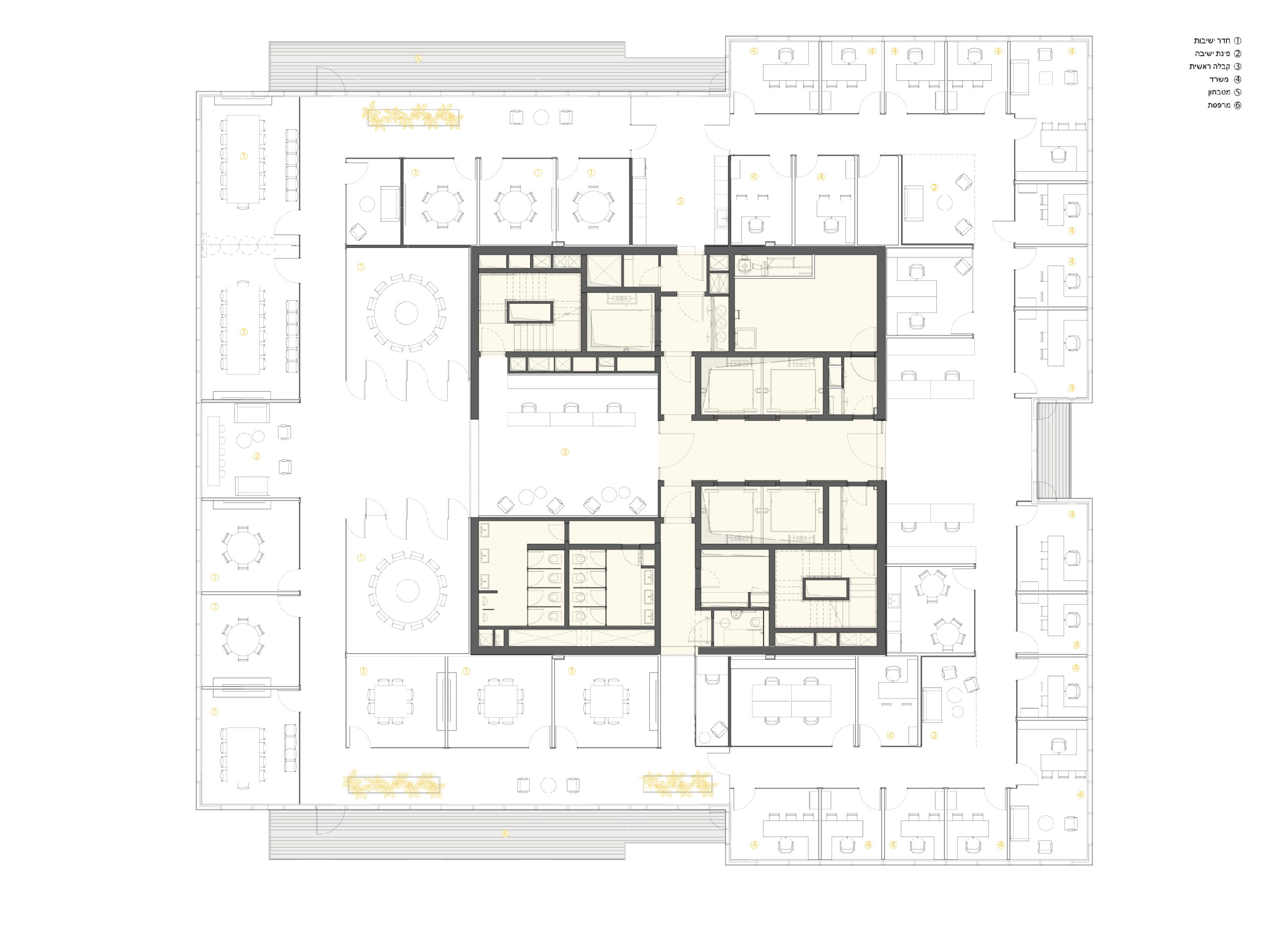
Despite offering a working space that enjoys piercing views through the expanse of the entire tower floor, the design succeeds in creating secondary spaces that are private, comfortable and tasteful. Each space is graced with a piece of art or design that invites the gaze to pause and reflect.
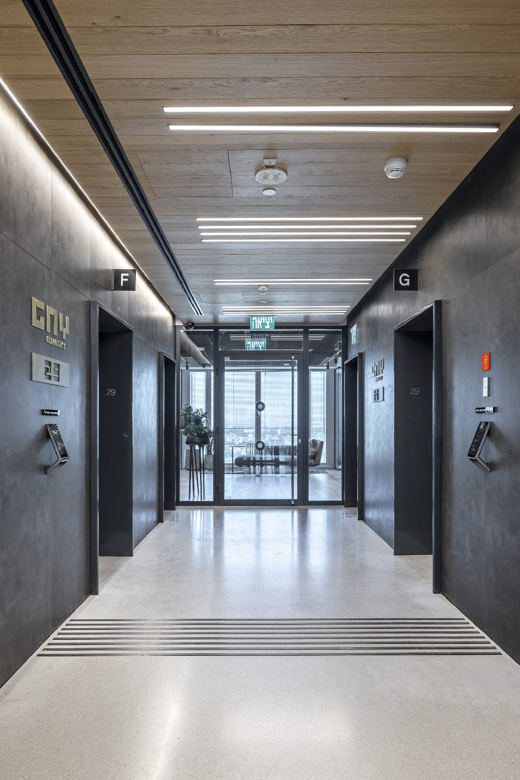
Paying attention to the entire spectrum of spaces in the building, the design offers a solution that’s both elevated as well as accessible and inviting. Using a darker palette, especially through the public spaces, with darker walls and ceiling finishes, a cozy yet classy solution emerges. Material touches such as terrazzo floors with oblique chess patterns in the dining and bathroom spaces make one imagine a chic bistro rather than what one might expect from a corporate law firm.
